Designing Transparent Account Flows to Build Trust
Giving users more control over their data by bringing account creation and deletion into the Canopy app.
Details
Role: Product Designer & Researcher
Platform: iOS & Android
Timeline: ~6 weeks
Team: 1 designer, 1 PM, 2 engineers
The Challenge
Canopy’s users needed a seamless and secure way to create an account and manage their personal data—but the existing experience was fragmented. Signup was handled entirely through external email links, disrupting onboarding and leaving users unsure if their account was active. Deleting an account required contacting support manually, creating frustration and unnecessary delays.
This lack of transparency reduced user trust, increased support load, and raised concerns around data control. Our goal was to bring both account creation and deletion fully into the app—streamlining the experience while giving users clear, intuitive control over their data. The result: a more trustworthy and user-friendly foundation for managing personal information within Canopy.
Here’s what users encountered in the original flow:
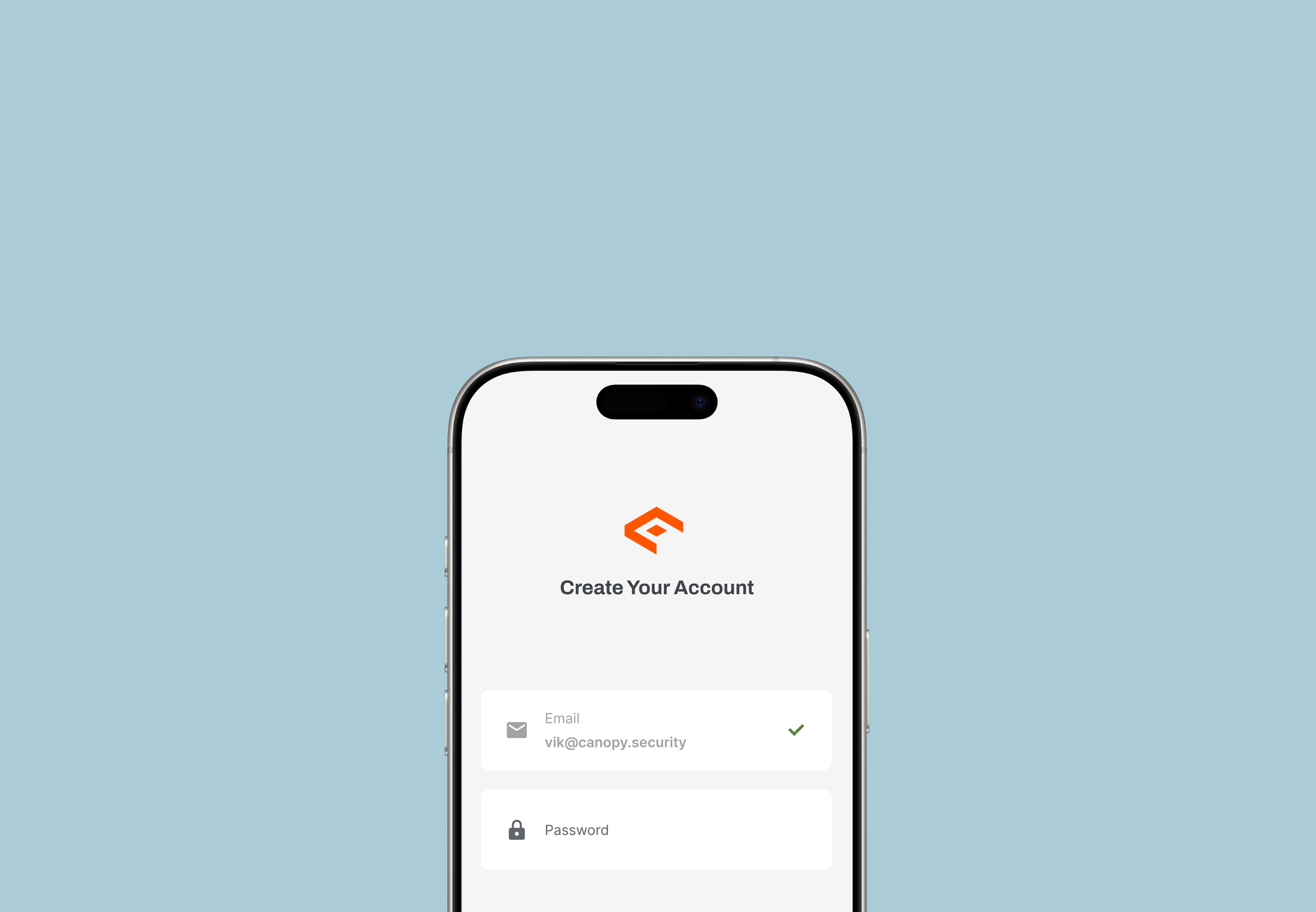
Users prompted to enter email and password, then tap Create. This is misleading since users may think they’re done with the creation process.
Quotes from our users:
Research & Discovery
We started by identifying pain points using:
Behavioral data from LogRocket (onboarding drop-off rates)
Conversations with Support teams
A competitive audit of privacy-focused apps (Signal, Apple, Proton)
Some of our key findings were:
Users expected to create and manage accounts in-app (as expected)
Deletion via support felt outdated and opaque
People wanted transparency on what data stays vs. what gets deleted
Exploration & Design Process
Account Creation
We explored multiple signup flows with different entry points:
From onboarding screens
Within the main settings area
As a blocker when accessing key features
We balanced:
✅ Ease of signup
🔐 Identity verification
🛠 Technical feasibility (e.g., token handling, account linking)
The final design integrated a short, intuitive in-app signup that felt natural and removed friction from first use. We ensured fields were minimal, used biometric login if available, and provided instant feedback on errors.
Account Deletion
Designing deletion was more sensitive. We prioritized:
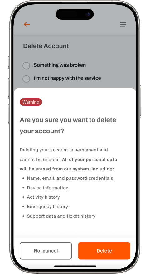
Transparency: Clear confirmation dialogs with specific details on what would happen
Safety nets: Undo window for accidental taps, and permanent deletion messaging
Compliance: GDPR-style language for clarity on what gets deleted and what remains
I intentionally avoided dark patterns—like hiding the delete button or using guilt-driven copy—and opted for user-first language throughout.
Final Designs
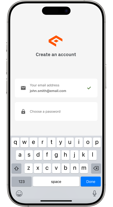
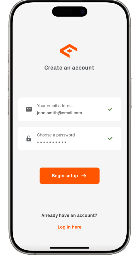
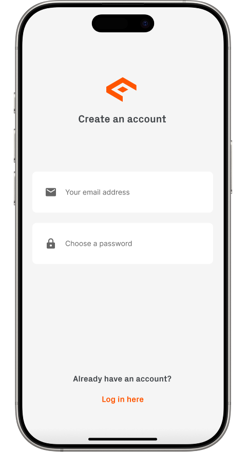
For the newly developed account creation process, I designed a welcoming splash screen that greets users upon opening the app. I collaborated with engineers to implement a solution that automatically detects first-time users, triggering the account creation flow by default. New users are prompted to enter their email and password, and upon successful input, I guide them directly into the next phase of setup—ensuring a smooth, intuitive start to the Canopy experience.
This approach is a significant improvement over the original flow, which relied on users navigating through external channels and left many unsure how to get started. By recognizing first-time users and guiding them through a native, in-app account creation experience, the new flow eliminates confusion, reduces drop-off, and sets a more trustworthy and polished tone from the very first interaction. Check it out below:
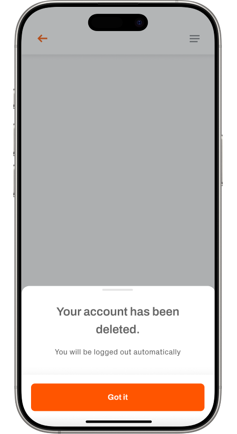
I moved account deletion into the app’s Settings to make it easier and more transparent. Users tap into Account, choose Delete Account, and have the option to share why they’re leaving—either by selecting a reason or adding their own feedback. Before confirming, they’re shown a clear warning explaining exactly what data will be lost. Once deleted, the user is immediately logged out.
This is a major improvement over the original flow, which required contacting support and waiting days for confirmation. Now, users are in control, and the process is fast, clear, and respectful of their data. Check it out below:
“I opened the app ready to create an account, but there was no clear way to do it. It felt unfinished and made it hard to get started.”
Design Tradeoffs & Product thinking
I removed optional fields from account creation to reduce abandonment, knowing I could collect more data later through progressive onboarding.
Worked closely with engineering to balance UX with backend constraints (e.g., account linking logic and deletion confirmation from the server).
Partnered with compliance/legal teams to align deletion copy and flow with internal data privacy policies.
Operated as PM to prioritize, track, and ensure delivery of these new features.
Outcomes
I was ecstatic to see the following outcomes within three months of launch:
18% increase in successful signups post-launch! 🚀
22% decrease in support tickets related to account deletion! ⬇️
Strengthened internal trust metrics (measured through user interviews and App Store reviews)
This feature laid the groundwork for future in-app settings like device preferences, Smart Alerts, and Snooze Monitoring.
takeaways
Designing for user trust and relief is about clarity, control, and respecting user autonomy. Even small moments—like a clear delete confirmation—can go a long way in making users feel safe and empowered.
This project deepened my appreciation for designing around edge cases, compliance, and sensitive UX—skills I’m excited to bring to any team focused on trust, transparency, and ethical product design.
“Having to leave the Canopy app to click a link or enter a separate code is frustrating - I feel like I’m going to lose onboarding progress.”
“I was nervous about deleting my account because I had no idea what data would actually be erased and what might be kept. There was no clear explanation.”
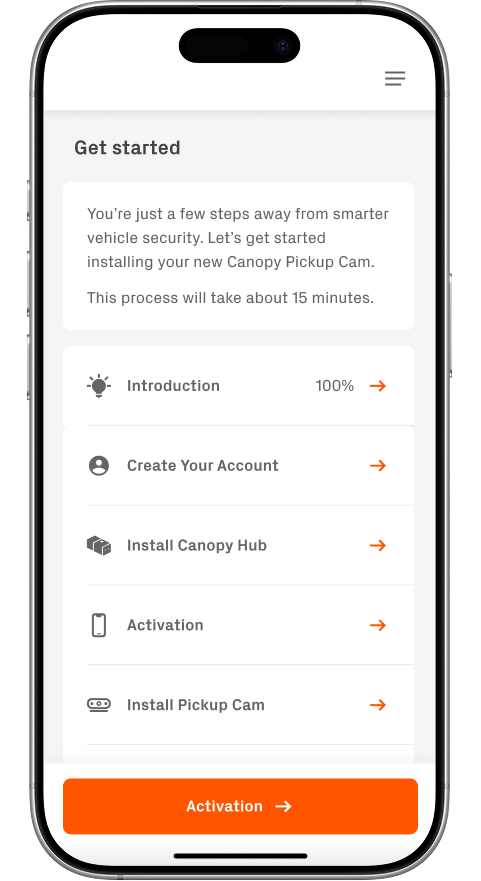
Initial designs for moving account creation to the onboarding process. Users would be introduced to Canopy, create their account, and continue through the hardware + software pairing process.
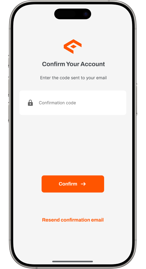
Users have to fetch a confirmation code from their email, enter it in the app, and then tap Create. Let’s just eliminate the code process right?
I thought to move the account deletion flow to within the support page. From here, if the user had any questions before deleting, reaching out to support wouldn’t be difficult.
“I needed to delete my account after running into an issue, but I had to email support and it took over a week to get it done. It was frustrating not having any control on my end.”
