Reducing alert fatigue with snooze monitoring
Designing a feature that helped users quiet repetitive motion alerts—bringing calm to their day without ever compromising their sense of safety or control.
Details
Role: Product Designer & Researcher
Platform: iOS & Android
Timeline: ~5 weeks
Team: 1 designer, 1 PM, 3 engineers
The Challenge
Users needed a way to temporarily pause security alerts and monitoring when engaging in normal, expected activity—like working inside their car, hosting a backyard event, or sitting in a sensitive meeting.
At the time, there was no easy way to prevent Canopy from triggering alerts based on intentional behavior. Users were forced to either disable the system entirely or deal with constant notifications—creating friction and reducing trust in the platform.
My goal was to design a lightweight “Do Not Disturb”–style feature that gave users short-term, activity-based control without compromising safety or long-term monitoring coverage.
Here’s what users encountered initially:


Exploration & Design Process
Snooze Entry Points
I explored multiple ways to activate snooze mode:
As a quick-action from the home screen (“Snooze Monitoring”)
In a dedicated menu for managing snooze states
I focused on making the experience:
Contextual (based on user activity or environment)
Flexible (choose from preset durations or custom end times)
Transparent (users could see and manage all active snoozes)
To keep it intuitive, I designed snooze presets to fit situations like:
“I’m near my car”
“I know my kids are playing on the driveway”
“I’m at my job site and there are lots of people walking around”
“I wanna turn it off for a few hours”
I envisioned each option would come with gentle reminders of what was being paused, and a clear timeline for automatic reactivation.
Final Designs
The final designs made it easy to pause alerts with one tap, tied to real-world actions and environments. Users could choose if they were near their car or set a custom time, with full control over what devices or zones were affected. I decided not to include the “I’m at work” preset since work hours vary widely across users and could create confusion around when monitoring would resume. Instead, I prioritized flexible, time-based options that gave users clear control and reduced ambiguity.
I ran usability tests with 8 users to refine copy, default states, and visual hierarchy—especially around confirmation and resume.
Check out the final designs below:
Users’ activity history was cluttered with repetitive alerts—often triggered by familiar, expected behavior like getting into their car or walking near the driveway. These false positives not only diluted the value of real events, but also made it harder for users to scan their history and spot what actually mattered. It was clear the system needed a smarter way to filter noise and preserve meaningful activity.
IIn addition to a cluttered activity history, users were bombarded with repetitive push notifications—sometimes dozens within a short span. For many, the only workaround was to silence their entire phone or disable Canopy notifications altogether—defeating the purpose of a real-time security system. I needed to design a more thoughtful, user-controlled way to quiet the noise without sacrificing peace of mind.
“I get nonstop alerts, and every time I check, it’s just my dog walking by. It’s gotten to the point where I ignore them all—or just shut it off.”
Discovery & Research
I uncovered key needs and behaviors through:
Analyzing LogRocket sessions to identify common alert patterns during “normal” user activity
Reviewing support tickets mentioning “false alarms” or alert overload during meetings, car work, or family events
Interviewing users who wanted more flexible ways to manage alerts based on their day-to-day lives
Key insights:
Users weren’t trying to turn off their system—they just wanted to pause it briefly (this became the center of the feature)
The idea of “snoozing” based on what they were doing felt intuitive and empowering
There was no simple way to see what was snoozed or when monitoring would resume

I was inspired by Apple’s duration customization for Do Not Disturb. Users should be able to choose how long they want to “snooze” for and then automatically resume at the end.

My initial design included the various states I was interested in exploring more closely. I thought being next to your car was a clear of example of receiving unnecessary alerts.
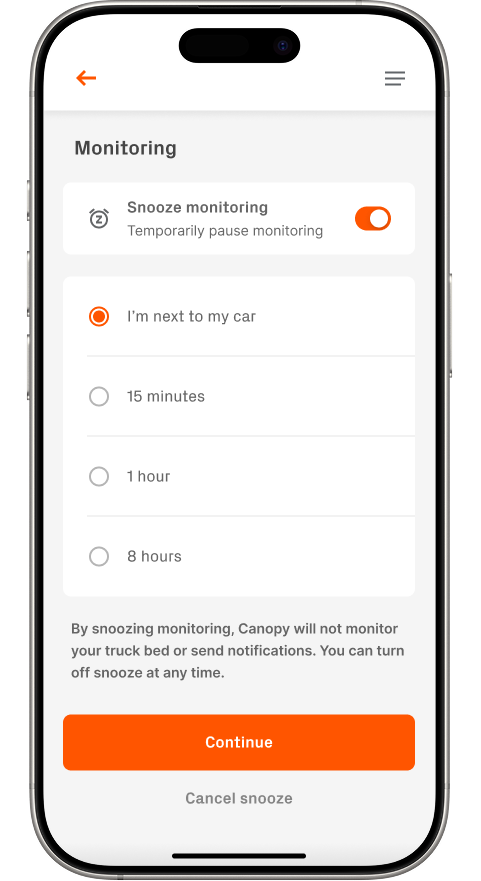
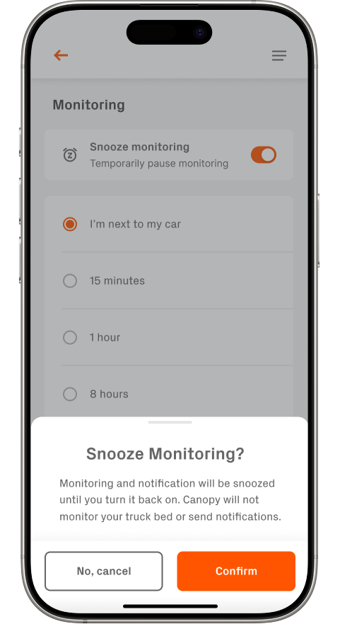
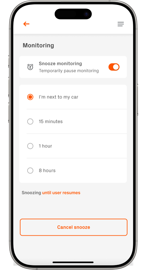
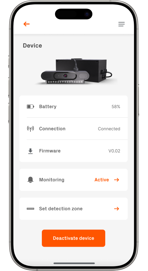
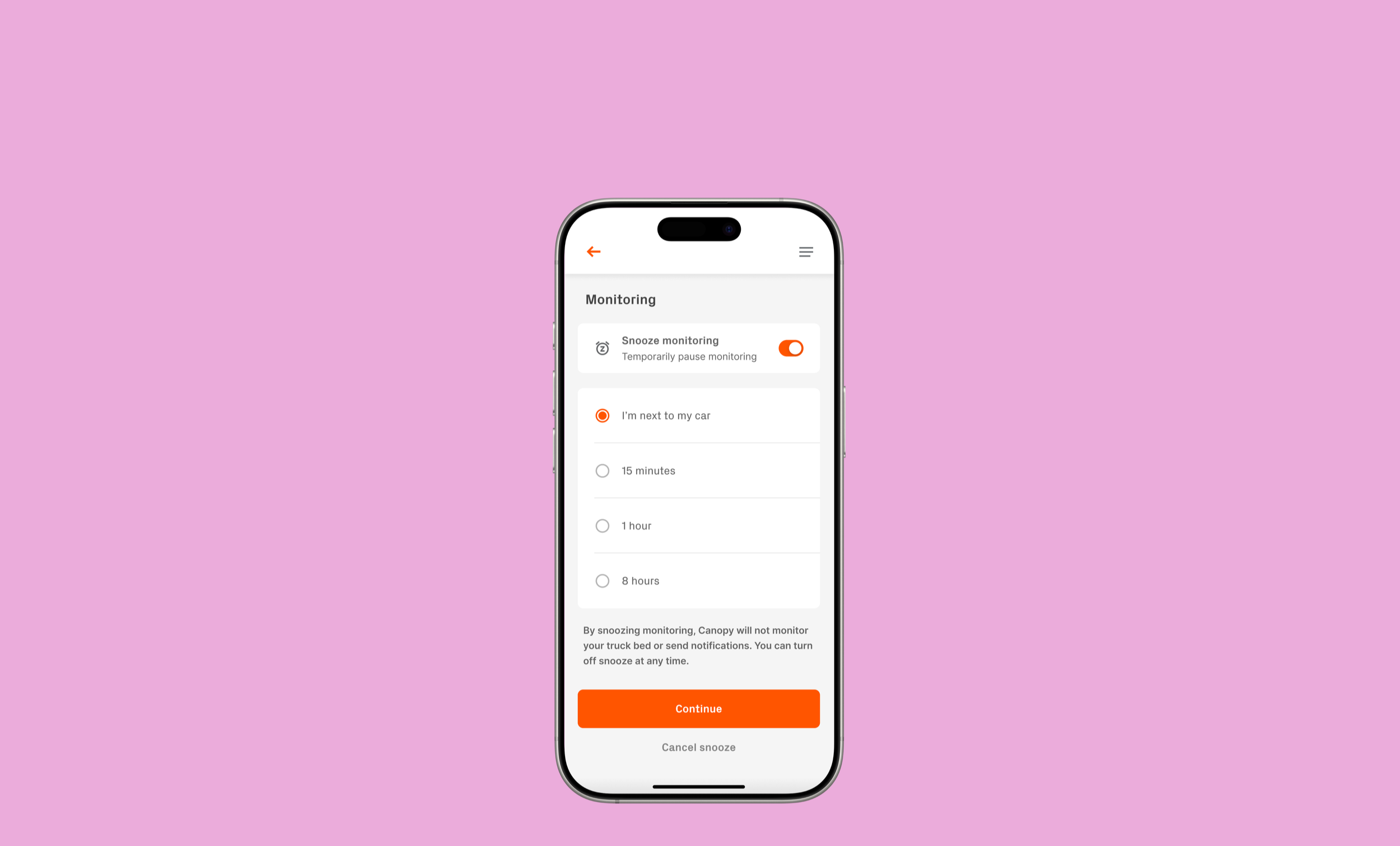
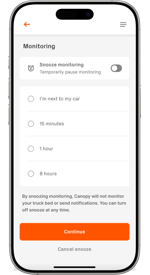
From the device page, users can access the Monitoring menu where they’re presented with the option to toggle Snooze Monitoring. They can choose from time-based options or activity-based presets—like “I’m next to my car”, which keeps monitoring off until manually resumed.
After selecting a duration, users are prompted with a confirmation screen to ensure intentionality before snooze begins. They can cancel the action or return to the device settings, where a clear “Snoozing Active” indicator confirms that monitoring is temporarily disabled.
Design Tradeoffs & Product Thinking
I intentionally avoided deep customization (like zone-by-zone snoozing) in the MVP to keep the experience fast and non-technical. We already experienced frustration from our users in response to slow processing.
I worked closely with engineering to define clear rules around overlapping snoozes, resume logic, and how to surface that a system was actively snoozed. Sitting in on engineering meetings revolving around the data being pulled from the device helped me tailor the experience to fit our technical constraints.
The goal was to keep the feature calm, clear, and respectful of user intent—not something buried or easy to misuse. I wanted to ensure that our users would not turn our notifications off completely because of chaotic situations, and I believe this solution indeed prevents that.
Outcomes
🔻 35% decrease in false alert complaints post-launch - this was huge!
📈 18% increase in engagement with device and notification settings
💬 Users described the feature as “simple and human” in follow-up interviews
Takeaways
This project was a reminder that the best UX is often about timing and context. Users didn’t want to “disable” their security—they wanted it to adapt to their lives.
Designing this feature helped sharpen my understanding of user pain-points, hardware/data/software coexistence, and priority-first UX. It’s a pattern I’d carry forward in any product where trust, control, and clarity matter.