The Problem
Users couldn't delete their own account. On a security app. Let that sink in.
Canopy is a vehicle security app. Users trust it with their vehicle, their location data, and their personal information. So when I discovered that deleting your account meant emailing support and waiting up to a week for manual confirmation, I knew we had a trust problem on our hands, not just a UX problem.
For a product built on the premise of safety and control, asking users to surrender control of something as basic as account deletion was doing serious damage. Account-related issues were generating roughly 15% of all incoming support tickets, and App Store reviews were calling out the lack of a deletion path by name. Users weren't confused. They were frustrated.
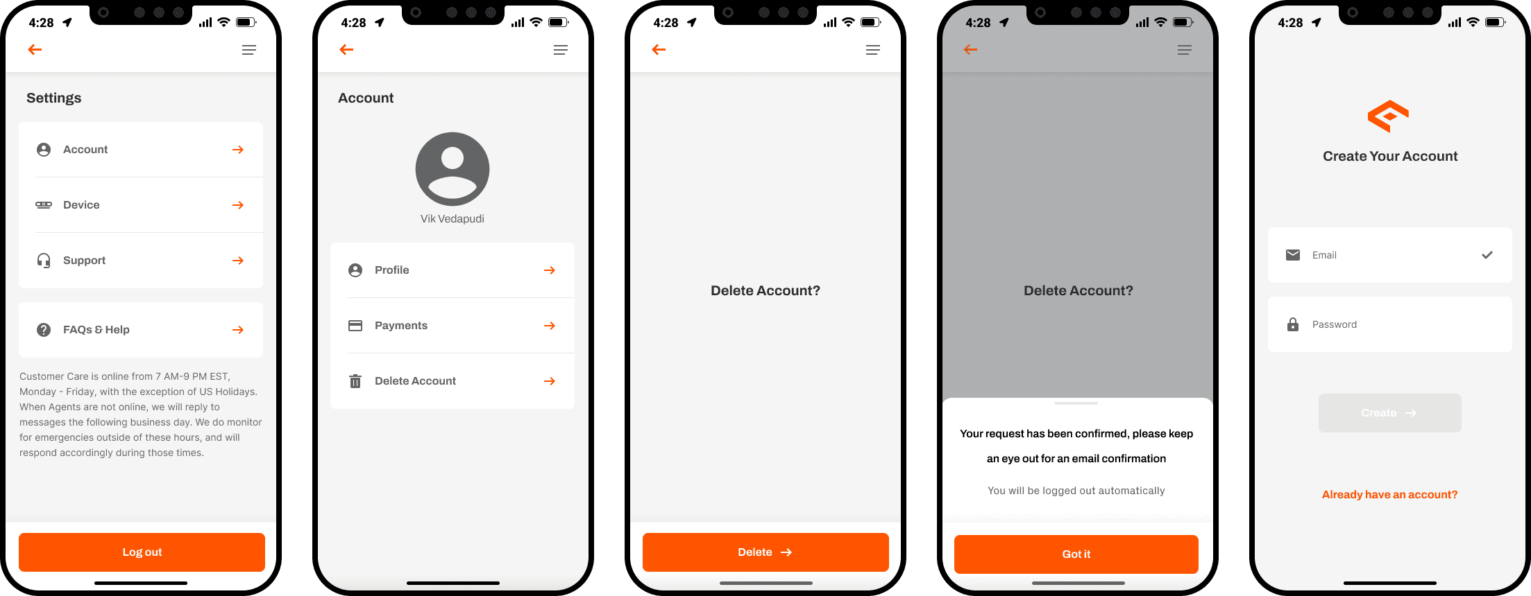
The original deletion flow. Users could find the path, but it ended with 'keep an eye out for an email confirmation' - no immediate action, no clarity on what gets deleted, no sense of control.
Discovery
I didn't have to look hard. Users were already telling me.
Before touching Figma, I reviewed Zendesk support tickets, watched LogRocket session recordings, and conducted 8 user interviews over Google Meet with people who had recently tried and failed to delete their account. Three clusters emerged consistently: trust, control, and anxiety.
How might we let users delete their accounts while giving them full ownership over their data and maintaining trust in our security product?
Trust & transparency
01- “No idea what happens to my data if I delete”
- “Feels like I don't own my account”
- “A security app should be more transparent about my data”
App Store reviews: 'no way to delete without calling support'
Control & respect
02- “Had to wait a week to delete, felt powerless”
- “Should be able to manage my own account”
- “Emailing support to delete felt disrespectful”
- “I just want a straight answer on my data”
Anxiety & abandonment
03- “I emailed support 10 days ago, still no response”
- “Didn't know if my deletion request went through”
- “No confirmation of what would actually be deleted”
Support tickets: ~15% account deletion-related
This isn't a friction problem. It's a trust problem.
Key Insights
Three things users needed that I wasn't giving them.
Ownership over their data
Users felt like Canopy owned their data, not them. Deletion being gated behind a support email reinforced that feeling. They needed an in-app path that made them feel like the data was theirs to control.
This meant the flow had to live entirely inside the app. No external emails, no support tickets, no waiting.
Immediate deletion
Waiting days for account deletion via support felt outdated and disrespectful. Users wanted to pull the trigger themselves, on their own timeline.
That meant no recovery windows, no deferred processing. The moment a user confirmed, the account was gone.
Data transparency
Users were anxious about what happens to their data when they delete. They needed a clear, honest breakdown of what stays and what goes, with no ambiguity.
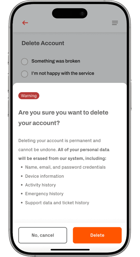
Generic reassurance wasn't enough. The design had to name exactly what gets erased, line by line.
The Reframe
I thought it was a UX problem. It was actually a trust problem.
Early on, I framed this as a friction problem, reduce the steps, speed up the process. But the research kept pointing somewhere else. The issue wasn't how long deletion took. It was that users had no agency over it at all. Every time a user had to contact a human to delete their account, they were implicitly being told: "You don't fully own this experience."
That reframe changed what I was designing. A friction problem asks: how do I reduce steps? A trust problem asks: does this experience make users feel in control? Those lead to very different solutions. It's why I added the data transparency screen rather than just shortening the flow. It's why the reason-selection step exists at all. Every decision ran through the same filter: does this give control back to the user?
Design Iteration
From emailing support to immediate in-app deletion.
The path to the final design wasn't straight. It started with formally documenting the problem, moved through an iteration that was technically correct but emotionally wrong, and landed on a solution that came directly from user feedback.
- 01Broken
Original state: email support to delete
The original deletion process required users to email Canopy support and wait several days for manual processing. No in-app path existed at all. Users had no visibility into the status of their request and no confirmation of what would happen to their data.
“I emailed support two weeks ago asking to delete my account. Still waiting. This is unacceptable for an app that holds my vehicle location.”, User interview feedback
- 02Product ownership
PRD: defining the problem before designing the solution
Before touching Figma, I wrote a Product Requirements Document outlining the problem, what users needed, the proposed solution, and how I planned to achieve it. This wasn't a design deliverable. It was a product decision. Writing the PRD forced precision on scope, surfaced engineering constraints early, and gave stakeholders a document to align on before any visual work began.
PRD sections: Problem statement, user needs synthesis, proposed solution, success metrics, out of scope decisions, engineering dependencies, timeline. Reviewed with PM and engineering lead before design started.
- 03Revised
First deletion flow: no reason-selection step
My first designed version went straight from the delete trigger to the data transparency screen. Clean, minimal, fast. But informal feedback from a colleague surfaced a problem: it felt abrupt, like the app was rushing them out the door.
“It feels like the app just wants to get rid of me. There's no moment where I feel heard before it's over.”, Colleague feedback, first design review
- 04Shipped
Final flow: reason-selection added as pacing mechanism
Adding the reason-selection step wasn't just about gathering product data. It was about giving users a moment to feel heard before the point of no return. The step also serves as a natural pause that reduces accidental deletions without adding bureaucracy. A critique became a better product decision.
“The reason screen actually made me feel like the app cared about why I was leaving. It changed how the whole thing felt.”, Usability test participant, final flow
- Problem statement
- Canopy users cannot delete their own accounts from within the app. The only path is to email support and wait up to 7 days. This creates significant trust damage for a product whose entire value proposition is security and user control.
- User needs
- Users need to delete their account immediately, without contacting support. They need to know exactly what data gets deleted. They need confirmation that the deletion has actually happened.
- Proposed solution
- An in-app deletion flow accessible from Settings, with a reason-selection step, an explicit data transparency screen, and immediate confirmation. No waiting period. No support contact required.
- Success metrics
- 22% reduction in deletion-related support tickets. Deletion flow completion rate above 85%. Zero support escalations from users who cannot find the deletion path.
- Out of scope
- Account recovery after deletion. Zone-by-zone data deletion. Third-party data deletion requests. These are v2 considerations after the core flow ships.
- Engineering dependencies
- Immediate account termination endpoint. Data purge confirmation from backend. Device unpairing triggered on deletion. All scoped and reviewed with engineering lead before design began.
Writing this PRD before any design work began is what made the engineering conversations productive rather than reactive.
The Solution
If you want to leave, you should be able to leave. Immediately.
Deletion is an act of distrust. My job was to make the moment feel resolved rather than punitive. Users wondering what happens to their data, whether it's permanent, whether they'll regret it, the worst thing the design could do was mirror that anxiety back at them.
The flow lives in Settings, Account, then Delete Account. A reason-selection step gives users a natural moment to feel heard. An explicit data transparency screen names exactly what gets erased. A final confirmation triggers immediate deletion, no waiting, no emailing support, no limbo.
Before: email to support
Step 1
Decide to delete account
Step 2
Search for how to delete
no clear path
Step 3
Email support
Step 4
Wait 5-7 days
avg. 6 days
Step 5
Receive confirmation (maybe)
- 5 steps
- No in-app path
- 6-day average wait
- No data transparency
After: in-app, immediate, transparent
Step 1
Settings → Account
Step 2 · New
Select reason
Step 3 · New
Data transparency screen
Step 4
Confirm → immediate deletion
- 4 steps
- Fully in-app
- Immediate
- Full data transparency
- 22% fewer deletion tickets
- Version 1Rejected
“Your data will be permanently removed.”
Generic and cold. Sounds like legal boilerplate. Gives the user no actual information and signals the app isn't taking the moment seriously.
- Version 2Rejected
“The following information will be deleted from our systems.”
Slightly better but still corporate. 'Our systems' creates distance. The user doesn't care about your systems, they care about their data.
- Version 3Shipped
“Here's exactly what will be deleted:
- · Your name and email
- · Device info and pairing history
- · Activity and alert history
- · Emergency contacts
- · Support history
This cannot be undone.”
Specific, honest, and in plain language. Naming the items shifts the feeling from 'this app is vague' to 'this app is accountable.' The final line is direct without being threatening.
Decide to delete
Anxious about data. Uncertain what happens. Possibly frustrated with the product.
Reason-selection screen. Gentle framing, no friction. The app asks why, not to block you, but to acknowledge you.
Select a reason
Slightly disarmed. Being asked why feels like the app is listening rather than just processing.
Short, non-judgmental options. No 'Are you sure?' guilt prompts. The tone is respectful, not retentive.
Read data transparency screen
Need for certainty. What exactly is being deleted? Is anything being kept?
An itemized list in plain language. No legal hedging. Every item named. The app is accountable, not evasive.
Confirm deletion
Ready to close the loop. Wants the action to feel final and clean.
Single confirm action. Immediate effect. No waiting screen, no 'request submitted' limbo. The account is gone when the user says it is.
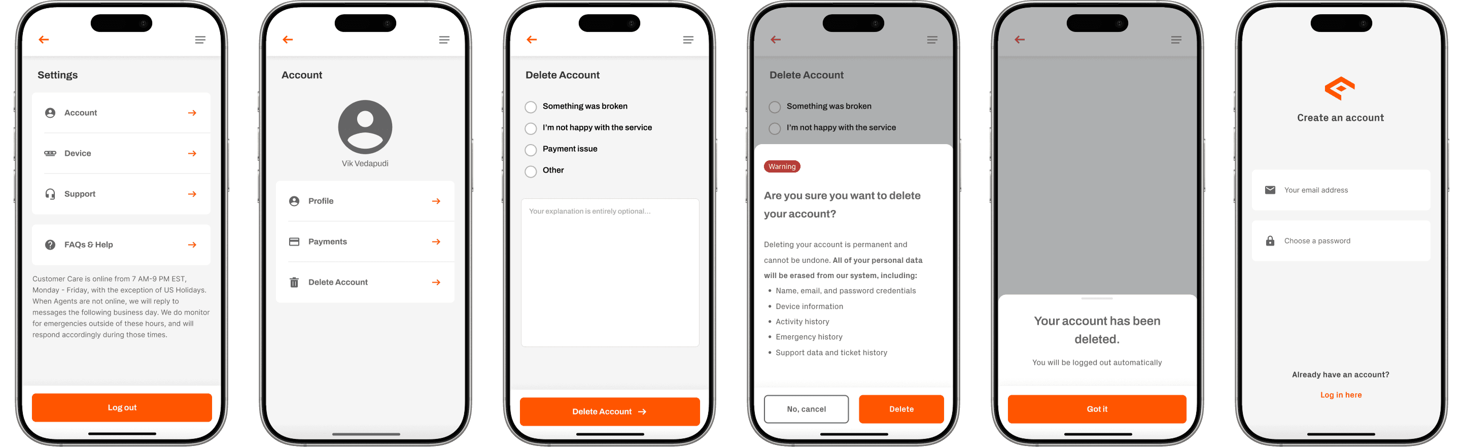
The full account deletion flow: from Settings to confirmed deletion. Transparent, immediate, respectful.
Key Tradeoff Evaluations
Two calls that needed sign-off.
Immediate deletion vs. 30-day recovery window
- Considered
- Add 30-day soft-delete with recovery (Product preference)
- Irreversibility risk
- User deletes accidentally with no recovery path.
Users who want to delete don't want a safety net they didn't ask for. The reason-selection step and confirmation screen already provide sufficient pause. A 30-day limbo undermines the sense of control the design is trying to restore.
Reason-selection step: include or skip
- Considered
- Skip it, cleaner, fewer steps (initial design preference)
- Emotional risk
- Without a pause, deletion feels abrupt and impersonal. Users may feel dismissed rather than respected.
The step adds one screen but changes the entire emotional tone. It makes the moment feel acknowledged rather than processed. It also provides product signal on why users are leaving, a genuine secondary benefit.
Both decisions required cross-functional sign-off. Product aligned on immediacy after UX framing. Engineering aligned on reason-selection after seeing usability feedback.
Key Design Decisions
Three calls that shaped the final product.
Explicit data transparency over vague reassurance
I could have gone with a generic 'Your data will be deleted' message. Instead I built a full itemized list: name, email, device info, activity history, emergency history, support data. It added a screen but massively reduced anxiety. Users who know exactly what's happening feel in control. Users who don't, don't.
Immediate deletion, not deferred deletion
There was a product debate about adding a 30-day account recovery window. My pushback: users who want to delete don't want a safety net they didn't ask for. They want the decision respected. The data backs this up: deletion-related support tickets dropped 22% post-launch.
Reason-selection as pacing, not just data collection
The reason-selection step wasn't just about gathering product signal. It was about giving users a moment to feel heard before the point of no return. That distinction matters. If users perceive the step as data extraction rather than empathy, it backfires. Copy and framing did the heavy lifting, the options are respectful, not guilt-inducing.