The Problem
Users weren't failing because the product was bad. They were failing because the setup process was.
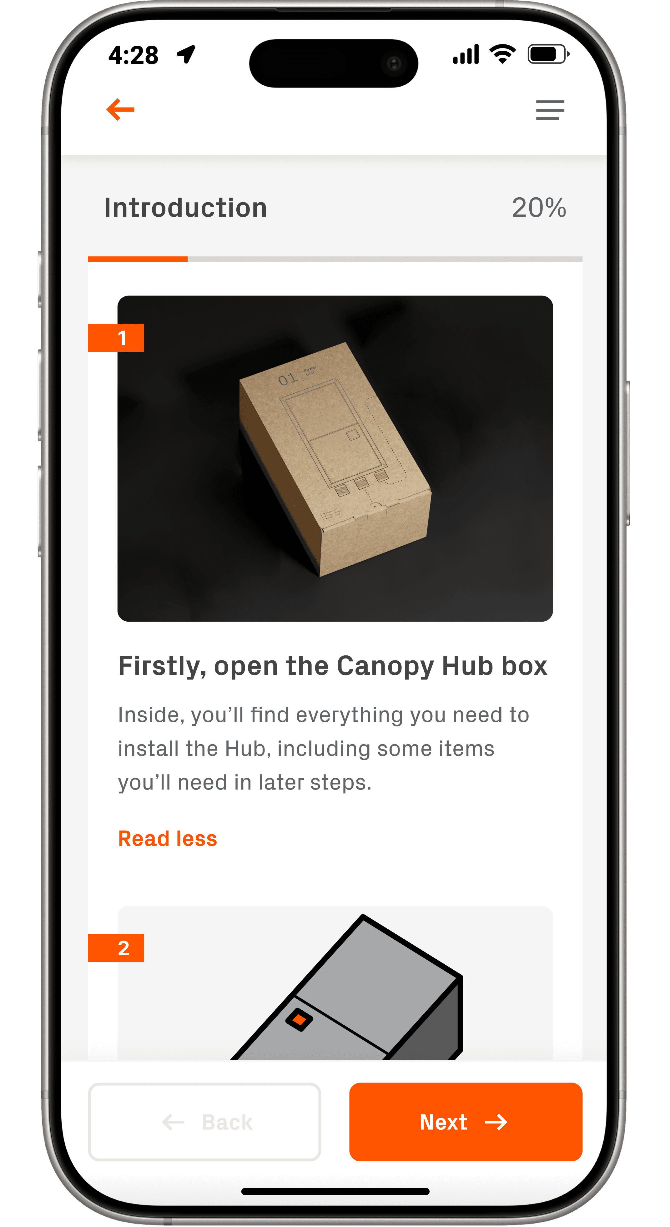
Canopy's onboarding had two distinct parts: a physical installation (mounting the sensing camera on the truck window, installing the power hub under the seat, routing cables to the OBD port) followed by a digital setup inside the app. Both parts had to work. Neither had been designed as a cohesive experience.
The result was a 30% completion rate. Seven out of ten users who opened the box didn't finish setup. Some got stuck on the physical install. Others made it into the app and dropped off during activation. A few got far enough to hit the software update step and never came back. For a security product, an incomplete setup meant a device that wasn't protecting anyone, and a customer who would never trust the product again.
Discovery
We didn't assume we knew what was broken. We went and found it.
I started by going through the entire setup process myself, repeatedly, until I understood every friction point from the inside. Then I brought in 30 paid volunteers for in-person usability testing, watching them attempt the physical installation and app setup while thinking out loud. I also had every PM and front-end developer on the team complete the process, which created shared empathy across product and engineering in a way that research reports alone never could.
On the data side, I pulled LogRocket session recordings to see exactly where users were dropping off, and used backend funnel analytics to quantify drop-off at each step. Zendesk support tickets tagged to onboarding issues gave us a clear picture of where users were getting frustrated enough to ask for help. I also audited four competing home security products, Nest, Ring, Eufy, and Arlo, to understand how others approached the physical-to-digital handoff and where users needed the most reassurance.
How might we redesign Canopy's onboarding so that users who open the box actually finish setup?
- 30
- in-person usability sessions
- LogRocket
- session recordings + funnel data
- Zendesk
- onboarding-tagged tickets
- 4
- competitors audited
Step 1
Mount camera & hub
- Mostly smooth
Step 2
Find serial number
Friction
“I had to flip the whole thing over just to find the serial number.”
Usability test
Step 3
Activate device
Lost
“I finished the hardware part, now what?”
Usability test
“I don't know how many steps are left.”
Usability test
Step 4
Software update
Biggest drop-off
“It's been 20 minutes and it's still updating.”
Usability test
“Can I leave the app? Will I lose my progress?”
Usability test
Step 5
Confirm protection
Trust
“I wasn't sure if my truck was actually being protected.”
Usability test
“I gave up and just called support.”
Zendesk ticket
Every breakdown was a moment where users lost control: they couldn't see where they were, what was happening, or whether it worked.
Competitive Audit
Four products. Dozens of screens. A clear picture of what good looked like.
There were no direct vehicle security competitors to benchmark against, so I looked at the closest analogs: Nest, Ring, Eufy, and Arlo. The audit focused on four questions: how do companies sequence installation steps, how do they handle the transition from physical setup to digital activation, where do they provide help and reassurance, and how do they build user trust and confidence throughout the process?
The biggest takeaway was the relationship between physical installation and the app. The best products treated them as one continuous experience, with the app providing real-time guidance through the hardware steps rather than assuming users would figure it out from the box alone. That directly informed the instructional booklet and the step sequencing of the checklist.
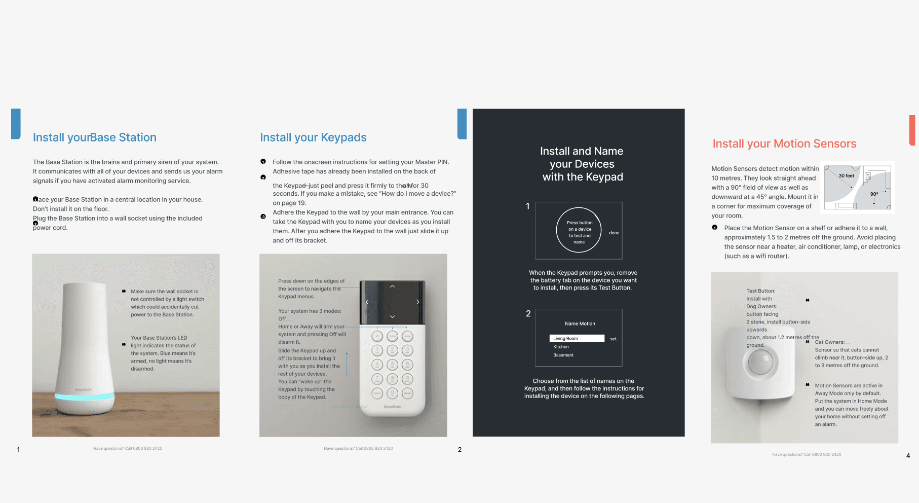
Competitor instructional booklets informed how we thought about sequencing physical installation steps and designing for low tech-savvy users.
Key Insights
Three root causes behind a 30% completion rate.
Users had no sense of where they were
Progress was invisible. Users couldn't tell how many steps remained, whether the app was doing something or frozen, or whether leaving would lose their progress. Without that context, anxiety replaced confidence and users gave up rather than pushed through.
This meant any solution had to make progress visible at every step, not just at the beginning and end.
The physical and digital setup were disconnected
The instructional materials didn't prepare users for the app, and the app didn't account for what users had just done with their hands. The serial number discovery problem was a direct symptom of this: hardware was designed without considering the software step that immediately followed.
Physical and digital had to be treated as one continuous experience, not two separate handoffs.
The software update was a trust killer
A forced 20+ minute update in the middle of setup wasn't just annoying, it broke the momentum users needed to get through a complex process. Users didn't know if they could leave, didn't know if it was working, and had no fallback when it failed.
Giving users control over when the update happened wasn't a nice-to-have. It was the single biggest lever for completion rate improvement.
The Reframe
I thought it was a complexity problem. It was actually a control problem.
The easy read on a 30% completion rate is that the setup process was too complicated. Too many steps, too much hardware, too much to ask of a first-time user. My initial instinct was to simplify, reduce the step count, tighten the copy, make it faster.
But the research kept pointing somewhere else. Users weren't quitting because the process was long. They were quitting because they felt powerless inside it. They didn't know where they were, couldn't tell if things were working, had no way to pause and come back safely, and were given no agency over a 20-minute software update that hijacked their momentum mid-setup. That reframe changed everything. The goal wasn't to make onboarding shorter. It was to give users enough visibility, feedback, and control that they felt confident completing it, however long it took.
Design Iteration
Five problems. Five solutions. All shipped over six months.
The work didn't unfold as a single project. Features were scoped, designed, and shipped in stages as each research pass surfaced a new root cause. Some required engineering alignment. Some required hardware changes. Some required packaging and copywriting. Each solution came directly from what users were telling us.
"I installed the whole thing and then it asked me for the serial number. I had to pull it out from under the seat. I almost gave up right there." Usability test participant
Serial number discovery: hardware change + Quick Serial Scan
The serial number was printed on the underside of the power hub, which users had already installed under the seat. Every user in testing had to detach the hardware to find it, then reinstall. I raised this with the hardware team and worked with them to relocate the serial number to an accessible surface. In parallel, I designed Quick Serial Scan, a camera-based scan feature that eliminated manual entry entirely and reduced input errors.
"It said it was updating and I just sat there for like 20 minutes. I didn't know if I could leave or if it would start over." Usability test participant
Software update: from mandatory mid-onboarding to deferred
The engineering team required a software update mid-setup. Users had to wait 20+ minutes with no feedback on progress. LogRocket showed significant drop-off at this exact step. I walked the engineering team through the research, showed them the drop-off data at that specific step, and quantified the cost of losing a user mid-setup vs. the cost of delaying an update. The update was moved to post-setup, giving users the option to install immediately or defer until they were away from the car.
"The checklist changed everything. I knew exactly where I was and how much was left. I didn't feel like I was going to lose my place." Post-implementation usability test participant
Onboarding checklist: making progress visible
Users consistently said they felt lost, no sense of where they were in the process or how much was left. I designed an Onboarding Checklist showing every phase (Introduction, Install Hub, Activation, Install Camera, Set Detection Zone) with completion indicators. Completed steps grayed out and showed 100%. Users could see progress at a glance and return safely if they needed to leave the app mid-setup.
"The app just kept spinning. No idea if it was working or broken. I gave up and called support." Zendesk ticket, pre-launch
Contextual feedback and failure states
When something failed on the backend, users previously saw a spinning wheel with no context. I added step-by-step status feedback throughout setup and designed failure states with clear explanations and possible solutions, before directing users to customer support. Users who knew what was wrong and had a path forward stayed in the flow instead of calling support.
Competitive audit insight: SimpliSafe's instructional booklet used a step-numbered layout with photos at every stage, significantly reducing the need to reference the app during physical installation.
Instructional booklet shipped with every Canopy box
A significant portion of our users were truck owners who weren't tech-savvy. The app alone wasn't enough. I drafted the copy, designed the layout, prioritized what to include, and worked with a copywriter to ensure quality. The booklet was designed to bridge the gap between unboxing and the first screen, physically guiding users through installation before they ever opened the app.
The Solution
One experience. Physical and digital. No user left behind.
The final onboarding experience started before the app, with an instructional booklet in the box that walked users through hardware installation step by step, designed for truck owners who weren't tech-savvy. Once in the app, the Onboarding Checklist gave users a persistent view of every phase with real-time completion indicators. Quick Serial Scan eliminated manual entry. Contextual feedback at every step replaced the spinning wheel. And the software update moved to after setup, giving users control over their own time.
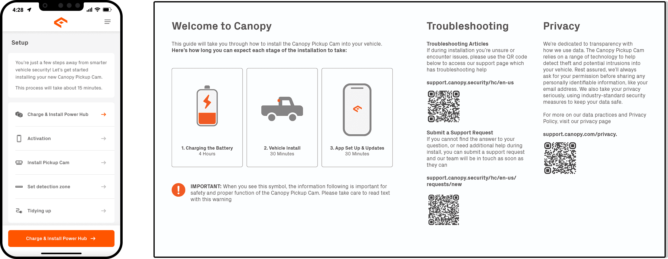
The Onboarding Checklist & Instruction Booklet.
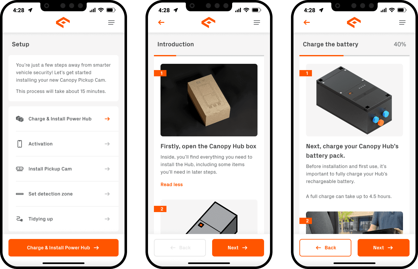
Some screens from the final onboarding flow.
Key Design Decisions
Three calls that shaped the final product.
Deferred the software update over engineering objection
Engineering insisted on the update mid-onboarding. The research showed it was the single biggest drop-off point. I walked them through the data, showing the cost of losing a user at that step vs. the cost of delaying an update that could run silently post-setup. The update moved. The completion rate jumped. Data beats instinct every time.
Hardware change over supplier friction
Moving the serial number location required going back to the hardware supplier in China, a real cost and timeline hit. The hardware team pushed back. I made the case that the current placement was causing measurable drop-off at activation, and that Quick Serial Scan alone wouldn't solve users who couldn't find the number to begin with. They made the change.
Checklist over progress bar
A progress bar shows how far you've come. A checklist shows exactly what's left, what's done, and gives you a way back in if you leave. For an onboarding with both physical and digital phases, the checklist gave users something to orient to across both environments, app open or closed. That specificity was the difference between users who came back and users who didn't.